Overview
Due to a lack of publicly releasable material I have taken to redesigning web interfaces in my spare time in order to keep my design skills sharp and build out a more comprehensive portfolio. This page is in its infancy, but will be added to over time.
Redesign Project: CraigsList
Infamous for its dated and inflexible designs, CraigsList was an obvious choice for a side project.
Redesign Goals:
Improve usability and simplify.
Modernize interface and improve accessibility.
Maintain current “look and feel” for brand familiarity.
Flexibility that is mobile friendly.
Methods:
Replaced outdated iconography with more recognizable icons.
This change is meant to improve usability through implementation of patterns found more readily across the internet. Coupling this change with tool tips will lower the learning curve for current users while allowing new visitors to the site to navigate it with less confusion.
Simplified view selection by eliminating redundant views.
CraigsList currently offers six views: list, thumb, preview, grid, gallery, and map. There is a lot of redundancy (list vs thumb, preview vs grid vs gallery) giving users options that are too similar for full utilization. Simplifying these options will give developers less code to maintain and users the impression each view has its own utility.
Implemented standard breadcrumb structure in header.
The website suffers from interaction overload, with clickable elements dominating the space. Dropdowns in the header that mimic the sidebar controls is both redundant and distracting. Simplifying to a breadcrumb navigation pattern that is still interactive but less cumbersome should improve navigation.
Flexed components to page width.
White space or “negative space” is not inherently bad, but CraigsList makes poor use of it. Flexing components to the width of the browser will make for better “browseability” and allow for additional information to be presented to the user. This change is also more mobile-friendly (see below).
Simplified search controls.
CraigsList offers users robust ability to change their search parameters via the sidebar and the control set at the top of the content. However, the controls are overly cumbersome, relying heavily on inefficient checkboxes for individual page controls. Implementing a multi-select drop down menu and limiting checkbox selections to more universal search controls will streamline searching.
Adding the ability to change the amount of search results per page will also improve quality of life for users.
Improved color palette.
Overusing of link text is visually overwhelming and gives the user too much to think about. Stripping the use of this color back to limited instances (like title text) will help with cognitive load. Icons do not need color unless color is meant to imply something to the user. A standard pattern for the “link” color is to navigate the user to a different page. This is not how CraigsList has implemented link text and colors and needs to be changed for more confident page navigation.
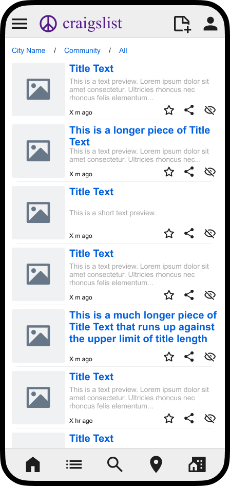
This CraigsList redesign allows for better translation to a mobile interface. Here, view controls have been hidden behind a menu icon, however the basic ability to create a post, search, navigate home, change view, change location, and change community remain available:


